
Is Your Homepage a Black Hole? These 5 High-Converting Homepage Layouts Can 3x Your Leads
You’ve spent countless hours crafting compelling copy, hired a top-tier photographer for those professional team shots, and maybe even invested a small fortune in rebranding. But despite all that effort, website visitors are still acting like tourists—they come, they look around, and they leave without ever reaching out. Have you ever wondered why two businesses offering the exact same service, with similar branding and almost identical copy, have drastically different conversion rates? A video I recently watched highlighted this perfectly: website B converted three times better than website A. The only difference? The structure—the layout itself.
So, stop treating your website homepage like a digital brochure. It should be your most powerful salesperson, and a great layout is its first impression and its most convincing sales pitch.
The Conversion Battlefield: Making Your Hero Section a “Client Magnet”
First, let’s focus on the most critical part of your site: the Hero Section. This is the very first screen visitors see, and it determines whether they stay or go.
If a visitor can’t instantly grasp three key things within three seconds, they’re gone:
What you offer. (Your clear value proposition)
How it helps them. (The benefit to the client)
How they can get it. (A clear call to action)
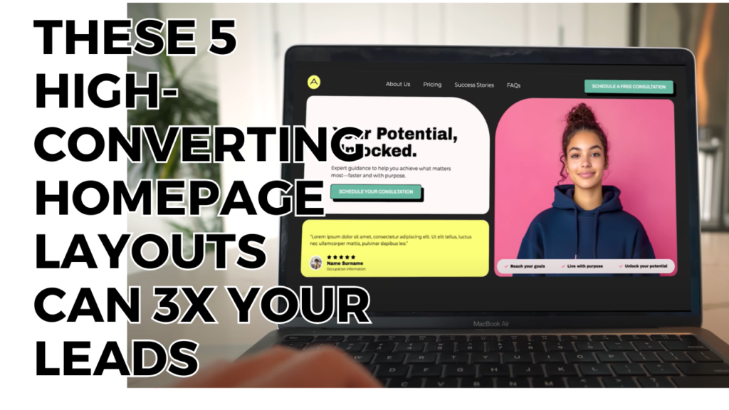
A common mistake is placing text directly on top of a busy image. While it can look cool, it often makes the text unreadable, especially on different screen sizes.
My personal experience tells me to separate the text and the image. Place your most important text on the left and the image on the right. This isn’t just an aesthetic choice—it’s backed by science. Countless eye-tracking studies show that users typically scan a webpage in an “F-shaped” pattern, starting from the left. By putting your headline on the left, you ensure your core message is captured immediately.
Steal These 5 High-Converting Homepage Layouts
These five homepage layouts aren’t just about looking good; they are strategic digital marketing tools designed to boost your conversion rate.
Layout 1: Text Above, Image Below — Guiding the Eye with Hierarchy
This layout breaks from the typical side-by-side design by putting the headline, sub-headline, and call to action at the top, with the image below.
Best for: Any business focused on clear information delivery.
My Insight: This design prioritizes “results first.” Visitors immediately see your value proposition (e.g., “We help you get more clients”) before getting a visual feel for your brand. It also cleverly integrates social proof, like statistics or results, right into the top section to build trust fast.
Layout 2: Multi-Image Showcase — Attracting Diverse Audiences
This layout features two or more images side-by-side in the hero section.
Best for: Businesses with diverse client demographics (like a speech therapist helping both toddlers and teens) or anyone who needs to show off a portfolio (designers, contractors).
My Insight: This is a powerful “social proof” technique. By showcasing a variety of happy customers, you help potential clients see themselves in your success story, thinking, “This service is for people just like me.”
Layout 3: Full-Width Background — Creating an Immersive Experience
This modern, high-impact layout uses a full-screen image or video as the background.
Best for: Businesses that sell physical spaces or experiences, like landscape designers, interior decorators, or event planners.
My Insight: The key here is readability. If you use a video or busy image, add a subtle, semi-transparent overlay to ensure your text is easy to read. This layout also often incorporates social proof elements, like testimonials, in a clean, contained box layered over the background to reinforce credibility without sacrificing the visual impact.
Layout 4: The Bento Box — The Modern, Modular Approach
Inspired by the Japanese bento box, this layout organizes different content elements (text, images, stats) into a clean, structured grid.
Best for: Businesses aiming for a modern, tech-forward, or highly organized aesthetic.
My Insight: This layout is excellent for mobile responsiveness. Its modular nature makes it easy to stack the elements vertically for a seamless mobile experience. However, be cautious with this one—it requires a strong sense of color and design to avoid looking cluttered.
My Digital Marketing Master’s Take: Layout Is Strategy, Not Just Aesthetics
The success of these layouts isn’t a coincidence. They are all built on a fundamental principle of digital marketing:
The layout dictates how users process information, and that directly influences their decision-making.
Layout 1 answers “what you do” instantly.
Layout 2 answers “is this for me?” with visual evidence.
Layout 3 answers “what does the experience look like?” with an immersive feel.
Layout 4 answers “how can I digest all this information?” with a clean, organized structure.
So, when designing your homepage, don’t just ask, “What looks good?” Instead, ask, “Does this layout help my potential customers understand my value and take action faster?”
The layout is your salesperson, the copy is their pitch, and the images are their professional look. All three must work together to drive success.